

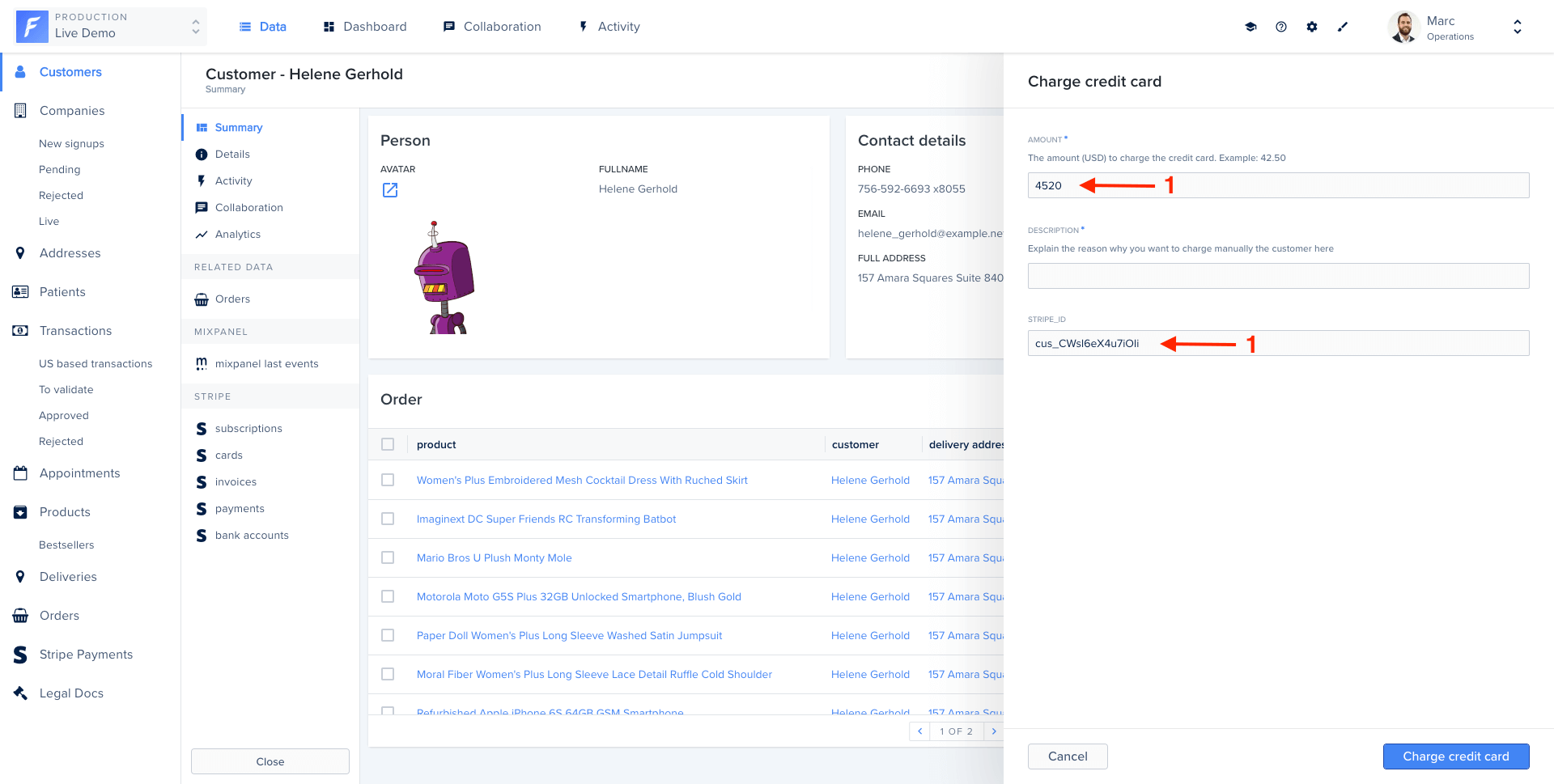
An action form displayed in Forest
Field properties
Fields are configurable using the following properties:Basic form example
Field types
String
Text input for short strings.TextArea widget for longer text:
Number
Numeric input with optional constraints.Boolean
Checkbox for true/false values.Date and Dateonly
Date picker for dates with or without time.Enum
Dropdown with predefined options.Collection
Reference to a record from another collection.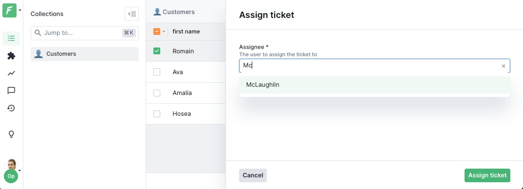
Collection reference widget on an action form
File and FileList
File upload fields.Lists
Arrays of values.Dynamic forms
Make forms reactive by using functions instead of static values. Functions receive the action context and access form values and selected records.Dynamic required fields
Make a field required based on another field’s value:Conditional visibility
Show or hide fields based on conditions:Default values from record data
Pre-fill form with data from the selected record:Dynamic enum values
Change dropdown options based on context:Dynamic collection references
Change the target collection dynamically:Widgets
Widgets customize the UI appearance of fields. Here are the most common ones:TextArea
Multi-line text input.
TextArea widget on an action form
TextInput
One-line text input, the default widget forString fields.

TextInput widget on an action form
TextInputList
One-line text input to enter a list of string values.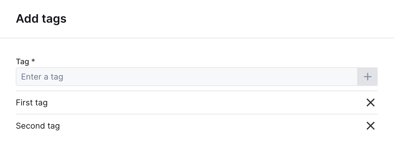
TextInputList widget on an action form
AddressAutocomplete
Text input with address autocomplete powered by the Google Maps API.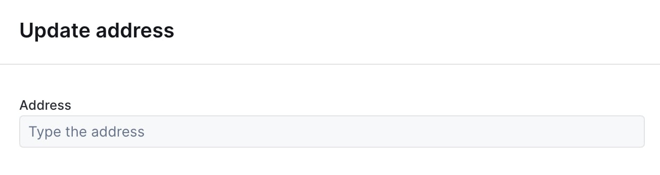
AddressAutocomplete widget, empty state
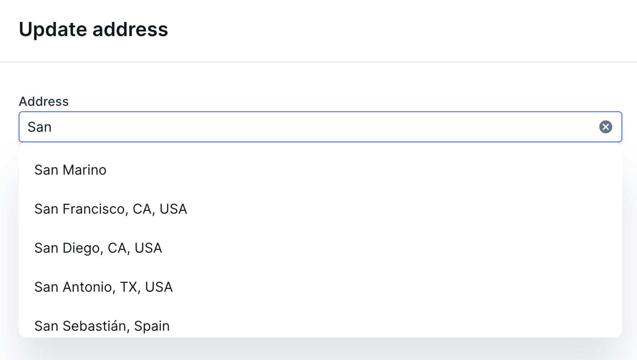
AddressAutocomplete widget, with suggestions
Checkbox
Single checkbox for boolean values.
Checkbox widget on an action form
Dropdown
Alternative to Enum for dropdown selection.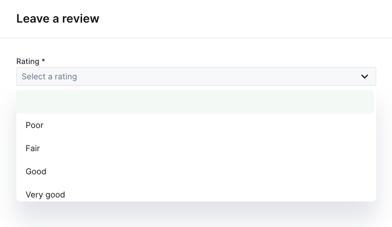
Dropdown widget on an action form
RadioGroup
Radio buttons for single selection.
RadioGroup widget on an action form
CheckboxGroup
Checkboxes for multiple selection.DatePicker
Calendar widget for date selection.TimePicker
Input for entering a time value.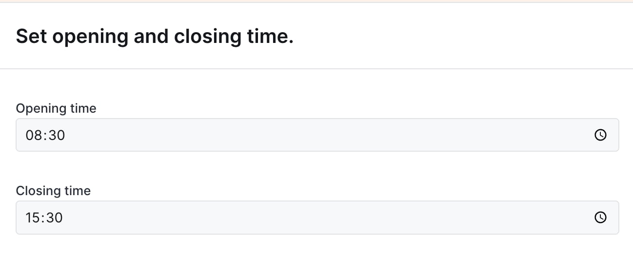
TimePicker widget on an action form
ColorPicker
Color selection widget.FilePicker
File upload with preview.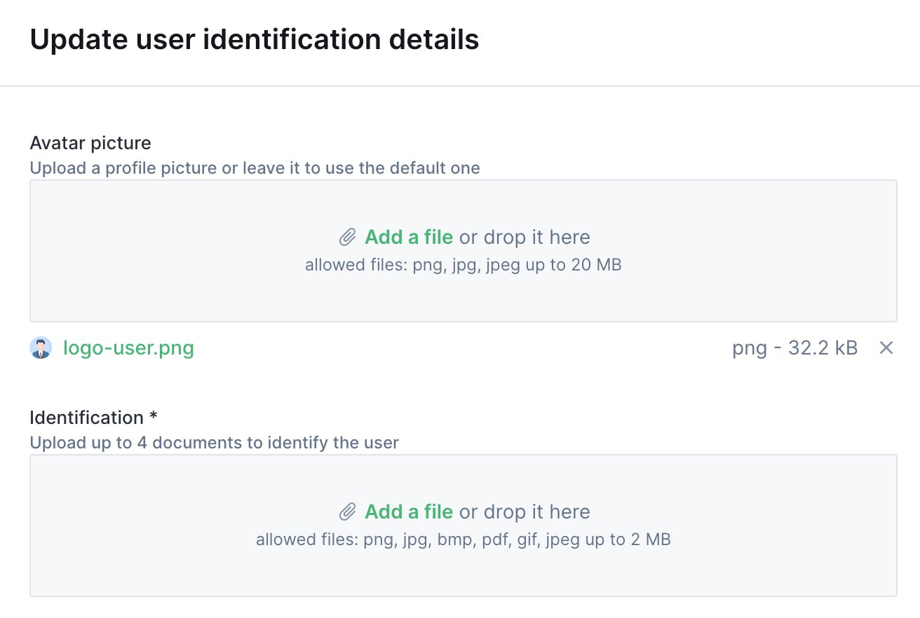
FilePicker widget on an action form
JsonEditor
JSON editor with syntax highlighting.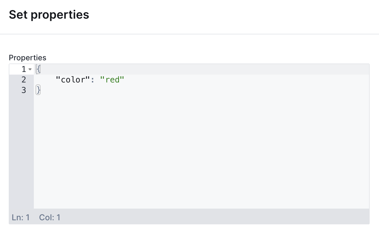
JsonEditor widget on an action form
UserDropdown
Dropdown pre-filled with Forest users.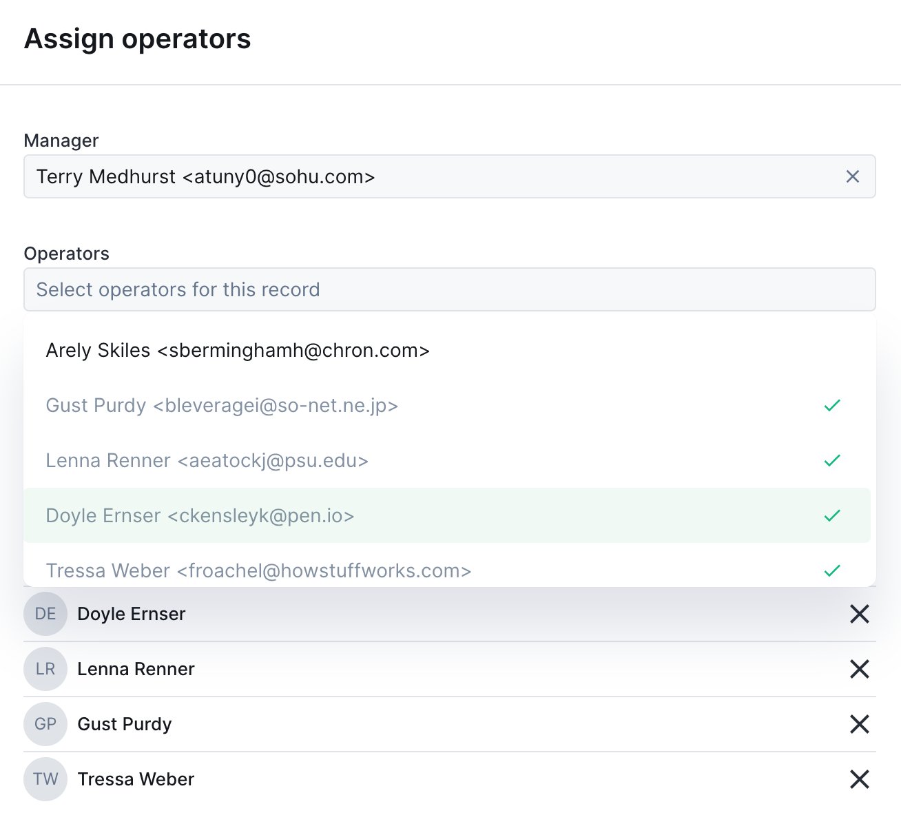
UserDropdown widget on an action form
CurrencyInput
Number input with currency formatting.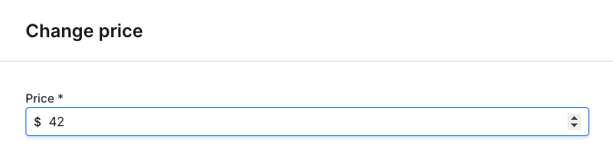
CurrencyInput widget on an action form
RichText
Rich text editor with formatting options.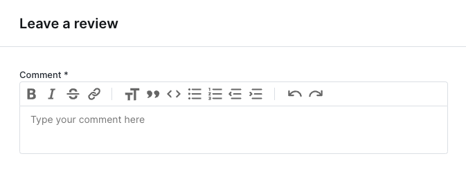
RichText widget on an action form
Advanced patterns
Multi-step forms
Create wizard-like forms by conditionally showing sections:Read-only fields for context
Show record data as read-only context:Validation with required fields
Combine conditions for complex validation:Accessing form values
In the execute handler, access form values from the context:Layout components
Organize your fields with layout components, separators, rows, HTML blocks, and multi-page forms. Useful when a form has many fields and you want to break it into manageable chunks.Common properties
Separator
A horizontal line between two form elements.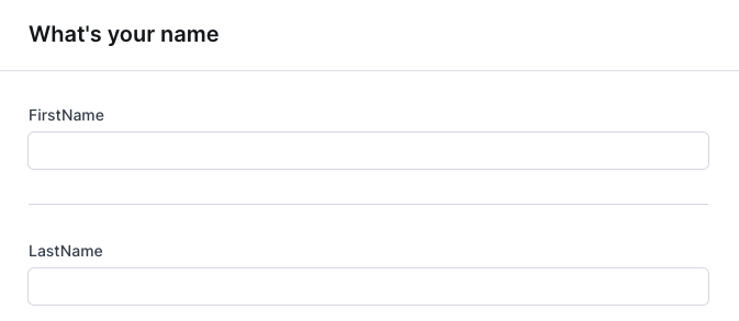
A separator between two fields
HTML block
Render arbitrary HTML content inside a form, useful for instructions, embedded content, or rich formatting.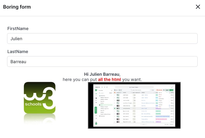
An HTML block rendered inside an action form
Row
Display two fields side by side on the same line.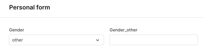
Two fields displayed side by side in a row
Multi-page form
Break a long form into multiple pages, with next/previous navigation.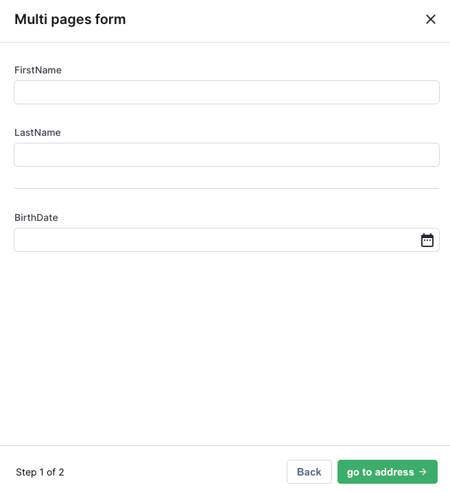
First page of a multi-page action form
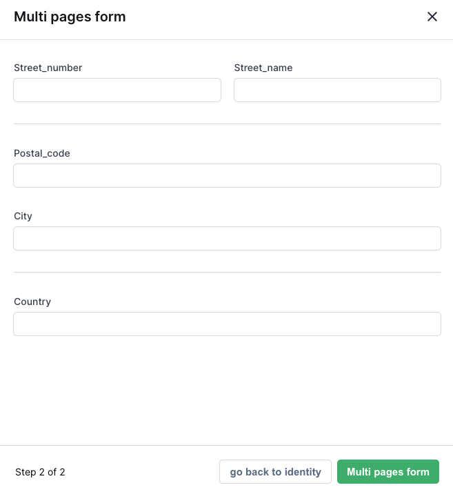
Second page of a multi-page action form
if conditions, the page is automatically removed. To prevent this, add an unconditional HtmlBlock explaining why the page is empty.